
Through the analysis of price movements the investor tries to identify the key price patterns as well as the important price points and generally the relationship between the pairs of interest. Through the correct application of Technical Analysis an
investor is able to make more accurate predictions on possible future price actions.
Charts have always been a major component in technical analysis.
What is a chart?
A chart is a graphical representation of the price action. Charts are useful to investors as they give the price action a visual order that is easier to interpret. They allow investors to identify relationships between certain price points through the application of trend lines, horizontal support and resistance levels, moving average and more complicates market studies such as Stochastics, Bollinger Bands, MACD and RSI
Types of Charts:
In this blog we will be focusing on 3 types of charts:
1. Line Charts
2. Bar Charts
3. Candlestick charts
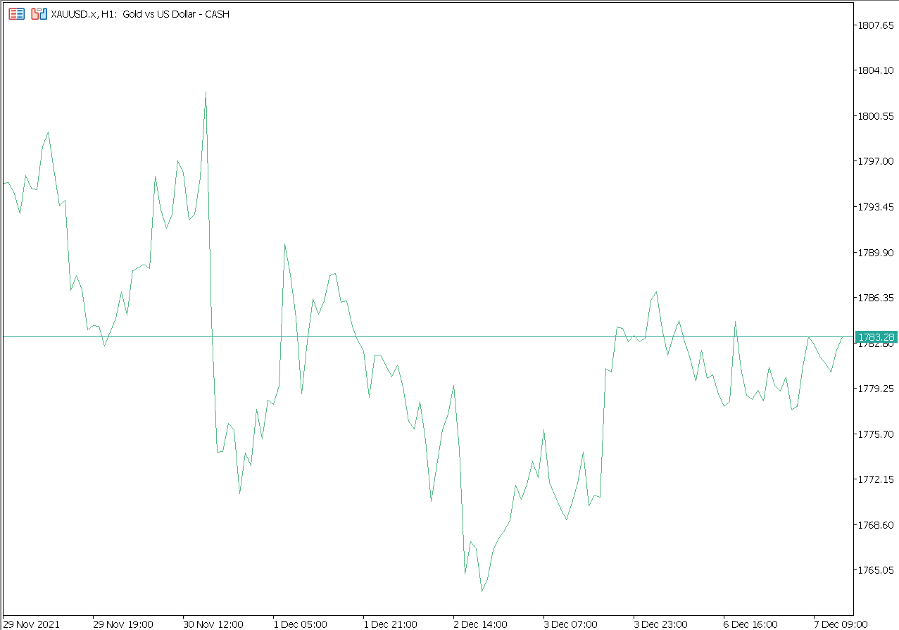
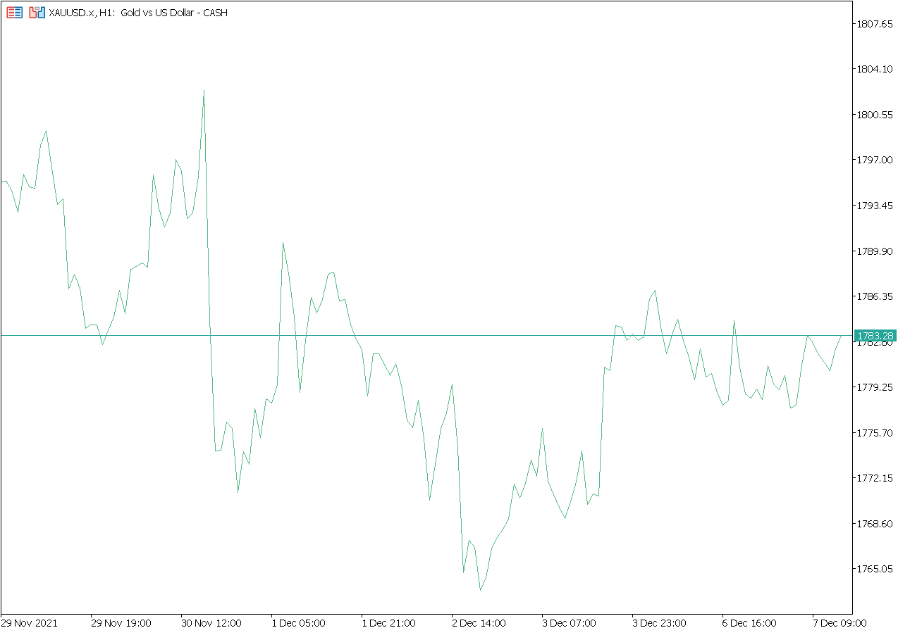
LINE CHARTS
Also known as Line on Close, the line chart is one of the least used charting methods. The reason is that its graphical representation of the price action as a sequence of closing prices gives the least information. However this very simplicity of the
chart, also offers a significant advantage over other charting methods.
The advantage is that its very simplicity reduces the visual noise that other charting methods present the investor with. In consequence the simplicity takes away the psychological pressure an investor experiences.
Furthermore the simple graphical representation makes it much easier for the eye to identify price patterns which could be lost in the noise of other chart types.
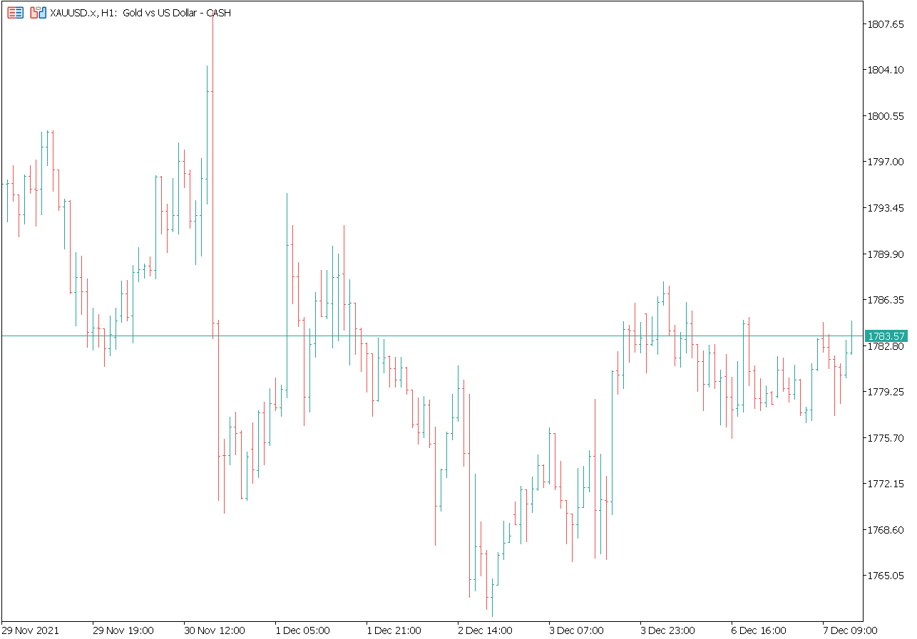
BAR CHARTS
Bar charts have been popular throughout the years in the West and therefore Bar charts are the second most popular charting types which are currently in use. A bar chart gives the investor four important price points over a specific period of time. These
being the open, high, low and close.
Traders and investors look at the structures created by the bar chart patterns as a means to predict the future direction of prices.
CANDLESTICK CHARTS
Candlestick Charts are by far the most popular charting methods investors use. Although very similar to Bar Charts, Candlesticks offer the investor additional visual clues on how the last period of their chosen instruments closed.
Candlestick charts do this by creating what is called a body between the opening and closing price. If the closing price posted a higher value than the opening price for the period the body will be shaded green.
If conversely the closing price posted a value that is lower than the opening price the body will be shaded red. The prices that fall outside the candle body are called the wicks. The top of the wick represents the highest
price the instrument traded to during a predetermined time scale and the bottom of the wick being the lowest price.
Follow our next blogs to learn more about the $5.3 trillion a day industry.
Disclaimer: The content of this page is for information purposes only and it is not intended as a recommendation or advice. Any indication of past performance or emulated past performance included in advertisements
published by Finior Capital is not a reliable indicator of future results. The customer carries the sole responsibility for all the businesses or investments that are carried out at Finior Capital.